Sign.com Growth Experiments
July 2024 - September 2024
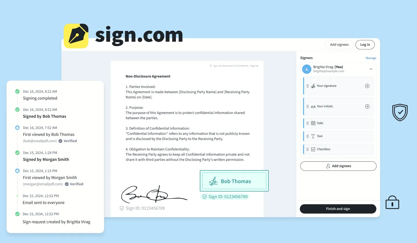
Sign.com, a spinoff from Smallpdf, is a digital signature platform for quickly signing and sending documents out for signature. Designed for both individuals and businesses, it offers an intuitive solution for electronically signing contracts and agreements.
Since Spring 2023, I’ve been the designer on the Sign.com team, working alongside product managers, engineers, and leadership to build the product from the ground up. Recently, we focused on bringing Sign.com into the public eye through a go-to-market strategy to achieve product-market fit and drive growth.
Context on the main flows in our signing tool
Self-signing documents
User uploads a document, and they add their own signature to self-sign. These documents are then sent to someone back by email or Whatsapp.
Sending sign requests to others
Sign requestors are the people that prepare a document in the signing tool and send it to someone else to get a signature from them.
Signing as a signee
Signees are the users that receive a sign request from someone else that they need to sign.
Designing and growing Sign.com since April 2023
When beginning to design the core product, my responsibilities were not limited to design itself. More than that, I contributed to the vision and strategy with a user-centered mindset, trying to deeply understand the problems our users try to solve and how we as a team can bring new value to their day-to-day. In order to achieve this, I facilitated various workshops with my team and leadership to align on key decisions that shaped the direction of Sign.com.
My initial focus was designing essential features, identified through collaboration with research and data. After our public launch in July, our team shifted focus to growth in order to increase our user base, generate more learnings faster, and ultimately shape the product further. Each week, we review top hypotheses, data, user insights, and opportunities, prioritizing experiments to test our biggest assumptions. Our goal is to find the right users, learn from them, and be able to define the Ideal Customer Profile.
Validating hypotheses through A/B Experiments
1. Increasing user confidence in the signup flow
🧪 A/B experiment 🚀 SuccessObservation: Users who progress far into the user journey (upload a document, fill out signee details, create their own signature) drop out when they see the sign up modal, when clicking on finish.
Hypothesis: They may not finish because they feel surprised or frustrated by the account creation modal.
Solution: Clearly explain the reasons for account creation and help users feel like they are close to completing the process.
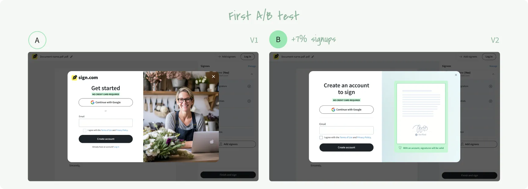
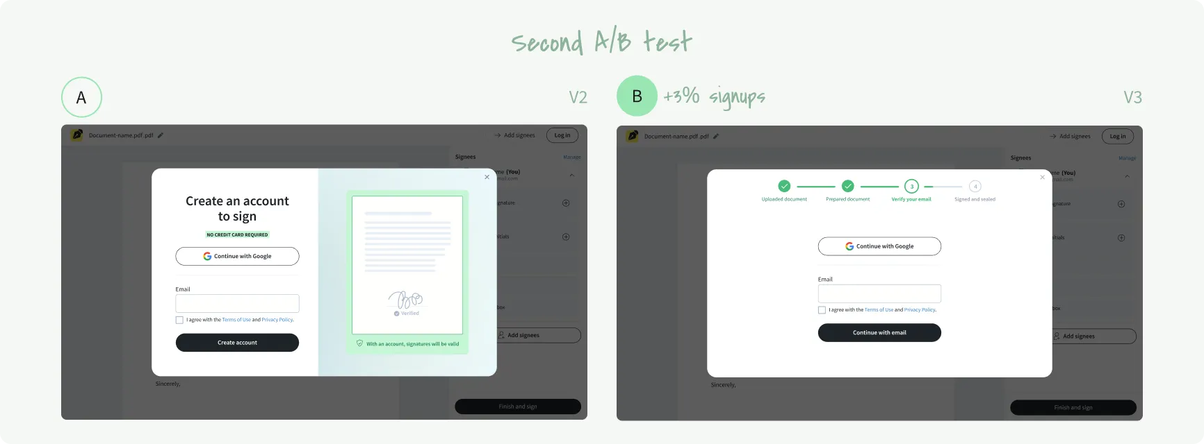
A/B tests: We conducted two A/B tests to evaluate the effectiveness of different signup modal designs in addressing user frustration and increasing signup rates. First A/B test: We compared a version that didn’t clearly explain the reasons for account creation against a version that added trust elements and included the reason in the title. Second A/B test: We compared the version with trust elements and a clear reason in the title with a simplified version that removed the illustration and displayed a clear progress indicator at the top.
My Role: I facilitated design critiques, gathering ideas from the team and prioritising them to address users’ frustrations with the account creation modal. I iterated on the design across multiple versions, incorporating feedback and testing various approaches. I created prototypes that clarified the account creation requirement, adding trust elements and progress indicators to guide users through the final steps. In collaboration with the UX writer, I ensured that the messaging and visuals conveyed reassurance and clarity.
Results
- V2 resulted in a 7% net increase in signups.
- V3 showed a 3% net increase in signups compared to V2. Although this result wasn't statistically significant (with a medium detectable effect set at 6%), we chose to release V3 because there was no negative impact, and we saw potential for further improvements.
2. Maximizing signee account adoption
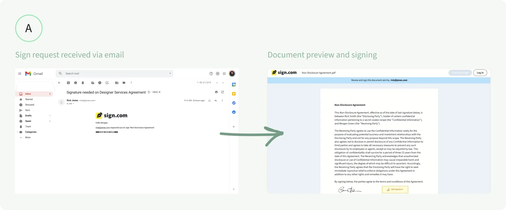
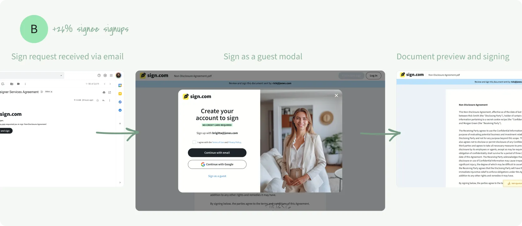
🧪 A/B experiment 🚀 SuccessObservation: When someone receives a sign request, it creates a new touchpoint with a potential customer. However, we noticed many signees would complete the signing process without creating an account, missing an opportunity for us to engage them further.
Hypothesis: We hypothesized that encouraging signees to create a free account immediately after signing would increase the likelihood of them becoming active users.
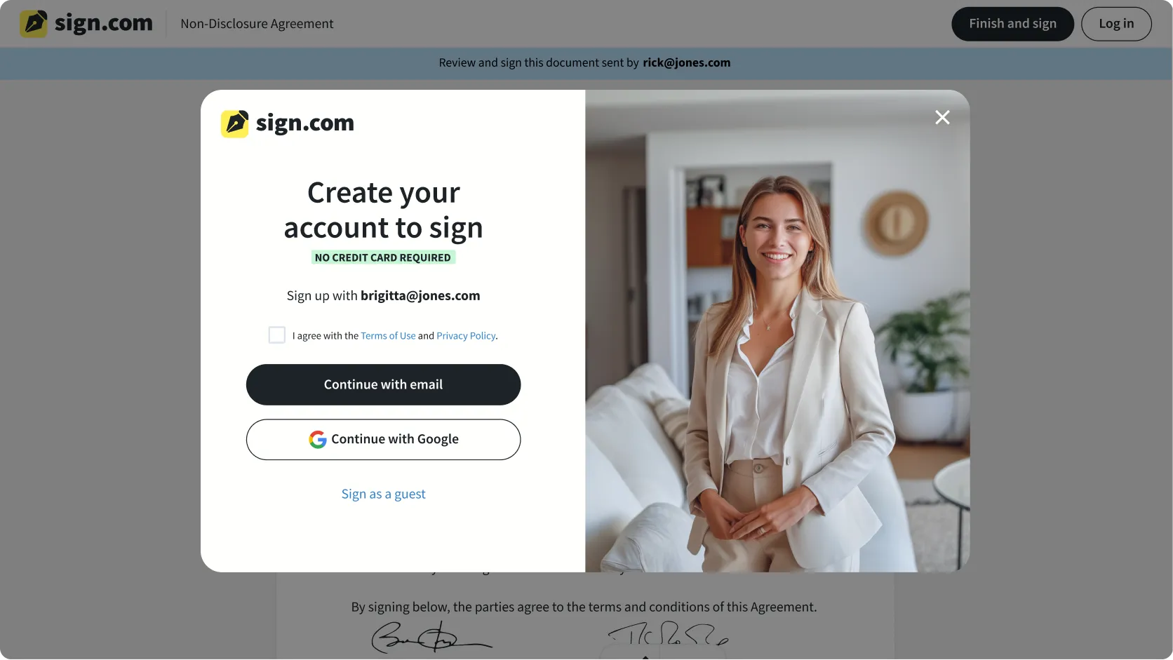
Solution: We added a simple account creation prompt after the signing process. While this initial version focused primarily on driving account sign-ups, it laid the groundwork for future optimisations.
A/B Test: To validate this approach, we launched an A/B test where signees were randomly shown either the original signing flow (control) or the new flow with the account creation prompt (variant). This allowed us to measure the impact of the prompt on account sign-ups. The variant with the prompt significantly increased account creations by 24% compared to the control, surpassing our expectations.
My Role: Through user journey mapping and ideation sessions, I identified the optimal placement and timing for the account creation prompt. By prototyping and testing different designs and messaging variations, I determined that a simple, direct prompt immediately when users enter the signing flow would be most effective. I created high-fidelity mockups to visualise the prompt and collaborated with cross-functional stakeholders to refine the design and implementation details. Ultimately, I recommended starting with a straightforward baseline version to assess its performance before iterating further.
Results
- 30% of signees created an account in the new version, compared to 7% before—a significant increase in account creation.
- While this is a strong result, the approach may be seen as aggressive, as it's not entirely clear to signees that creating an account is optional.
3. Educating self-signers about secure document signing
🧪 A/B experiment 🚀 SuccessObservation: Self-signers who completed their signature process rarely returned to send sign requests to others, limiting potential user engagement and platform adoption.
Hypothesis: We hypothesized that self-signers weren’t converting to sign requestors because they lacked awareness about both the security risks of using multiple platforms and the benefits of Sign.com’s complete signing workflow.
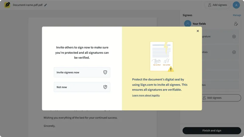
Solution: We implemented educational touchpoints early in the user journey to highlight the value of secure, verifiable signatures and the benefits of keeping the entire signing process within Sign.com.
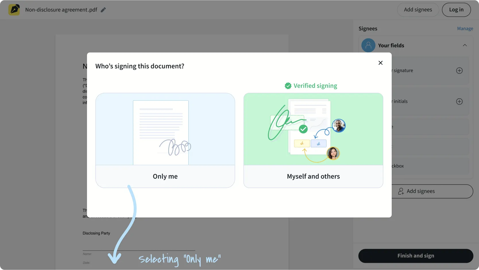
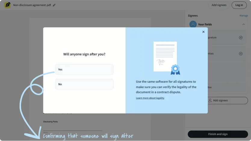
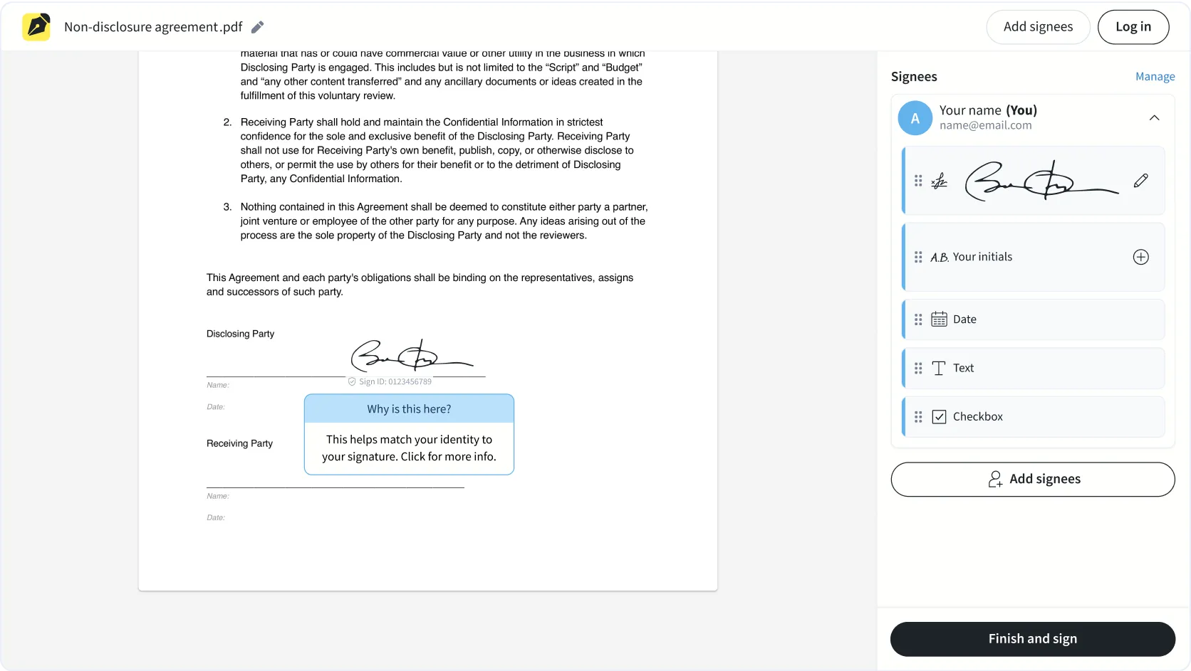
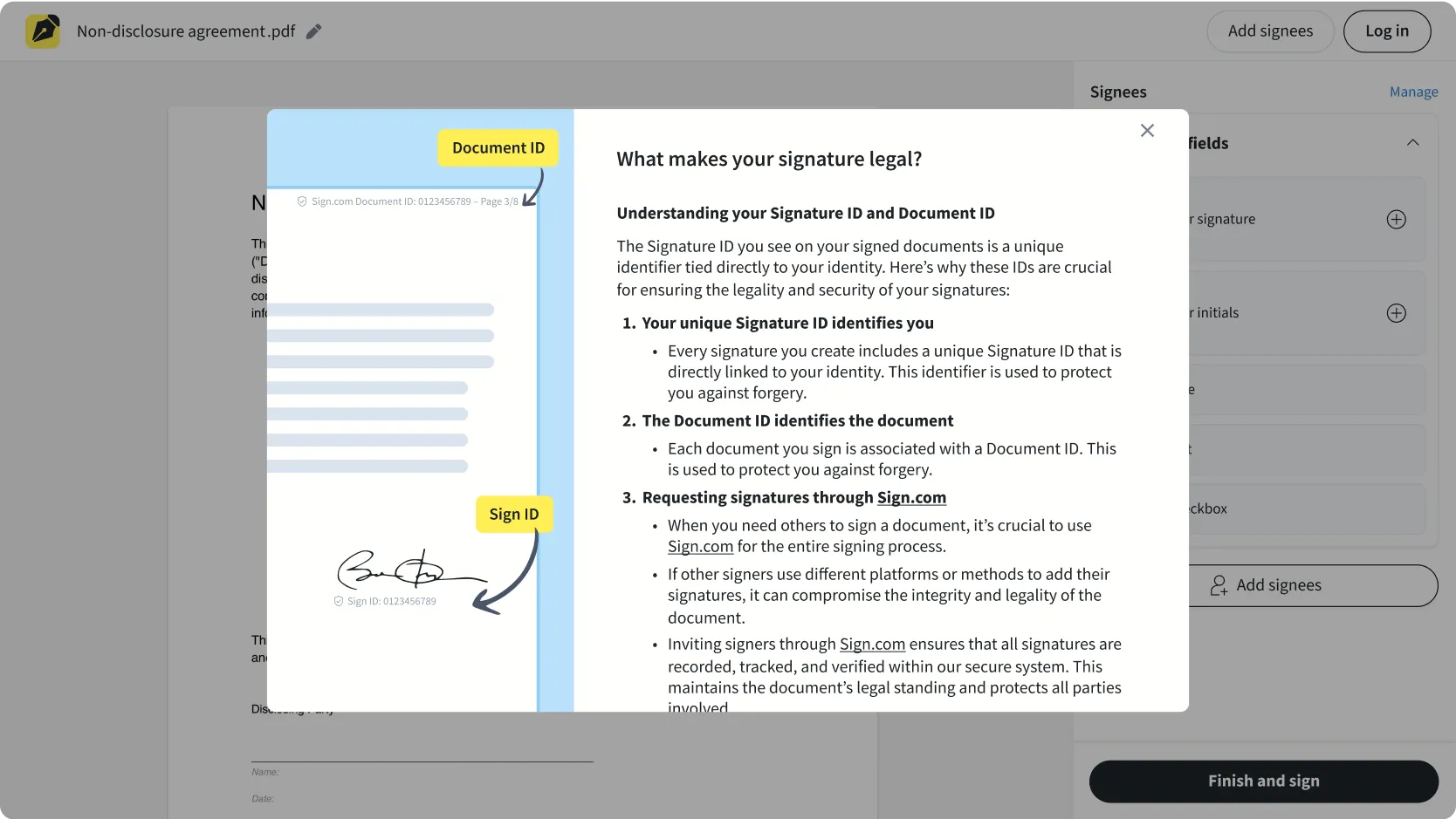
A/B test: We created a variant where users selecting ‘Only me’ received a prompt asking if others would need to sign later. This allowed us to introduce messaging about signature verification and document security. The variant also included educational elements like tooltips explaining Sign ID verification and signature legality. We compared this against the control where users directly entered the signing tool without guidance.
My Role: I led collaborative ideation sessions with stakeholders to develop and refine our messaging strategy. Through iterative prototyping, I tested different ways to present security benefits and risks, deliberately introducing friction points to gauge user commitment and understanding. Working closely with our UX writer, I developed trust-building UI elements and educational tooltips that would challenge users to consider their complete signing needs before proceeding. This intentional friction was designed to encourage users to make more informed decisions about their signing process, even if it meant a slightly longer user journey.
The signature ID is hoverable and clickable for more context
I added a central resource that will tell the user more about legality
Results
- We observed a 10% increase in sign requests sent, suggesting that our efforts to educate users on eSigning benefits may have contributed to a stronger understanding and comfort with the process.
- We believe this increase may also be partly due to users feeling more confident about the Sign ID feature. Given the clear improvement in sign request success rates, we chose to release this version. To further validate our hypothesis around education, we plan to conduct a follow-up test where we remove the extra modal after the initial 'Choose signing mode' step.